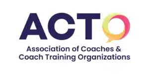
We have exciting news to share with you! We’re thrilled to announce our brand new logo and color palette.
Over the years, ACTO has continuously developed and strengthened its commitment to fostering diversity, equity, inclusion, and belonging within the coaching profession. Below is a brief overview of our Stand:
ACTO is a community of coaches and coach trainers dedicated to co-creating a more diverse, equitable, and inclusive coaching profession. Through dialogue, learning opportunities, and change initiatives, we seed coaching excellence that values diverse cultural perspectives and eliminates bias and harm.
Recognizing the importance of our Stand, we felt it was time for our branding to evolve. Our new logo and color palette are designed to symbolize this commitment and our exciting vision for the future.
OUR LOGO
You’ll notice our new logo features colorful speech bubbles. These aren’t just pretty shapes – they represent our community’s vibrant diversity of voices. Each bubble stands for the unique perspectives and experiences that make our community so rich and dynamic, all integrating into a collective wisdom that guides and strengthens us.
Special thanks to our designer Putra Widyasmara, whose creativity and design craft brought our idea to life. You can learn more about his work on Dribbble.
.
OUR COLOR PALETTE
Now, let’s talk colors! Each color has been hand-picked to represent the essence of ACTO’s values and mission. We also wanted to step away from any color combinations specifically associated with particular countries to express the global nature of our community. Here’s what each color means:
- Navy Blue: This color remains from our previous palette, honoring our legacy and the remarkable work of those who came before us. It represents the trust and integrity that are fundamental to our community.
- Light Green: Symbolizes growth, renewal, and wisdom, reflecting our dedication to continuous learning and development.
- Orange: Conveys warmth, creativity, and a splash of fun, highlighting the innovative and supportive spirit that embodies our community.
- Pink: Represents passion, energy, and a whole lot of enthusiasm, showcasing our heart-centered commitment to making a positive impact in the coaching industry.
These colors and our new logo aren’t just about looking pretty. They’re about capturing the essence of our vibrant, dynamic, and fun community and our commitment to the ACTO Stand.
ACTO members can access the member logo to proudly display on their website, social media, and more at https://actoonline.org/resources/ (You must be logged in to access this page.)
We’d love to know what you think about our new visual identity and any other feedback you have at acto@actoonline.org.
Thank you for being such an integral part of ACTO.
Warm regards,
Rei Perovic and Sharon Brown
Co-chairs, Membership and Communications Committee
Board Members, ACTO – Association of Coaches & Coach Training Organizations


